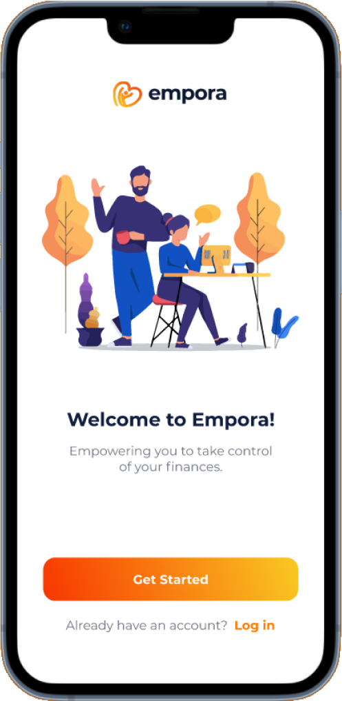
Empora

A Mobile App that Connects Users with Financial Advisors

*This project is still in its prototype stage and has not yet been developed or launched by the client. The prototype shown here is based on the latest feedback from the client, but it may change in the future based on further revisions or requirements. The project may be parked by the client for a long time before it goes live.

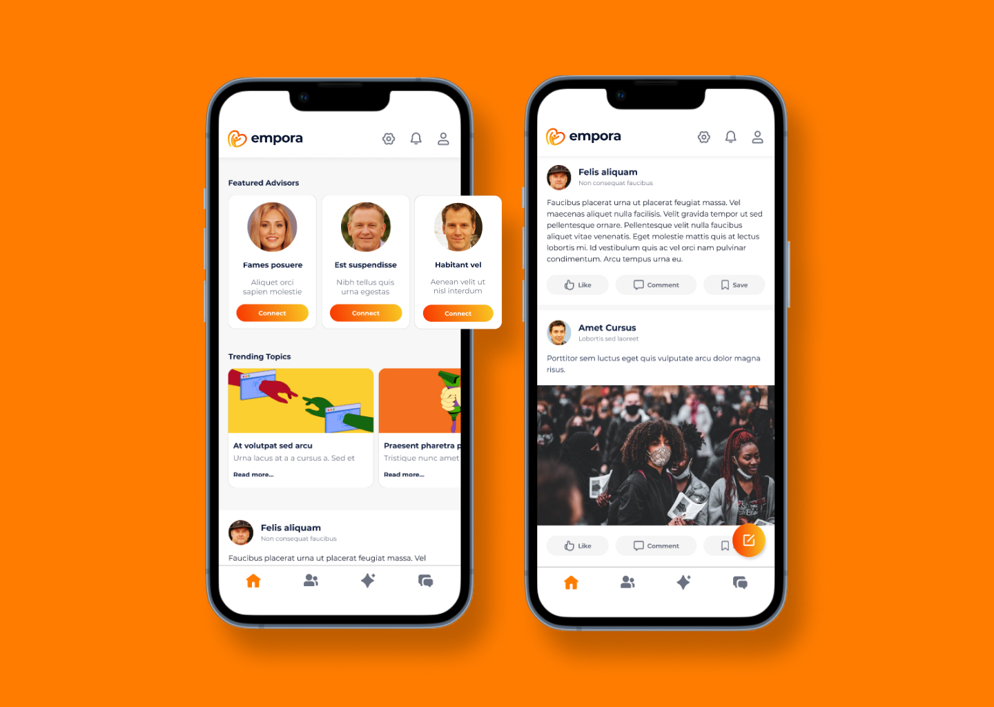
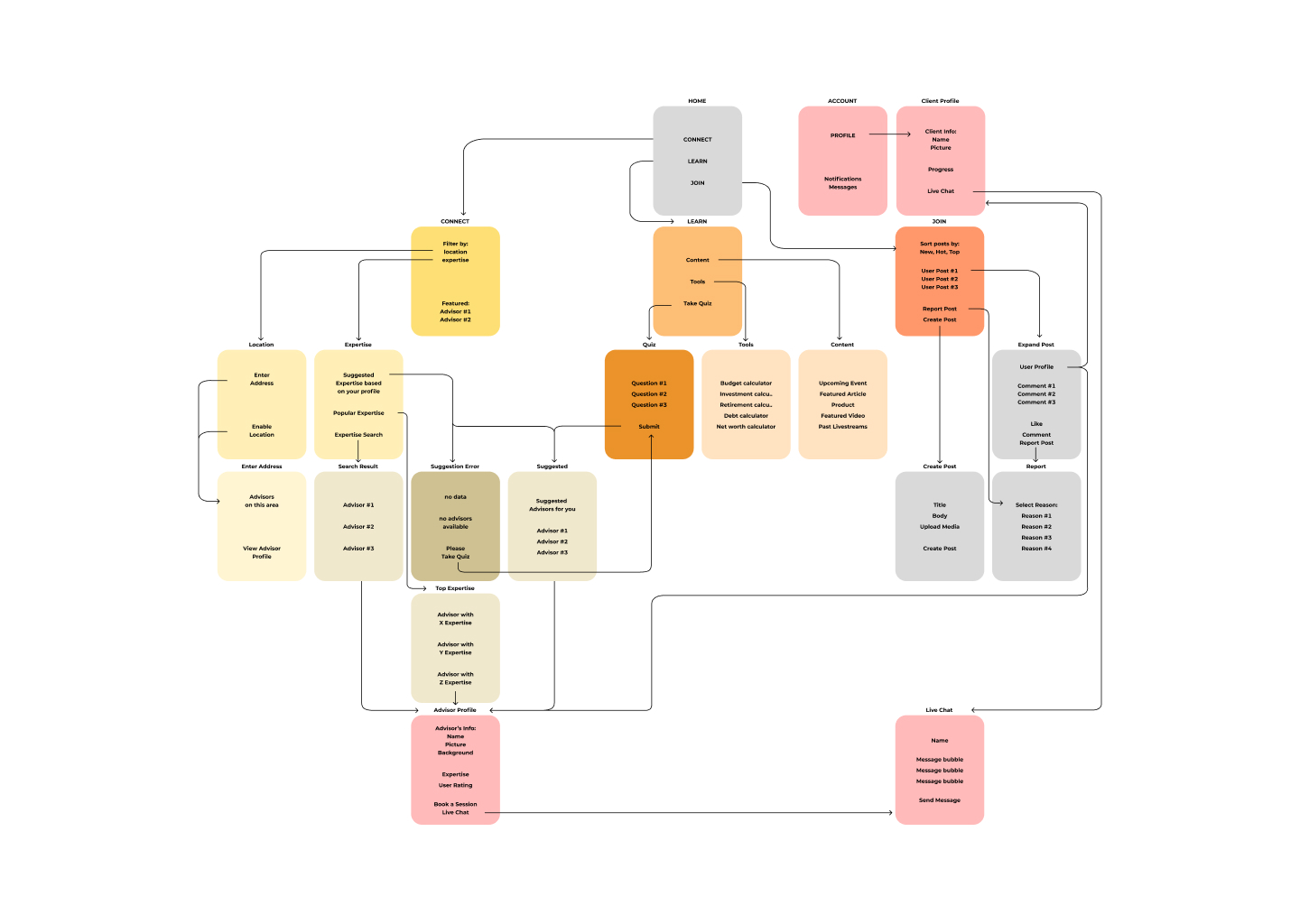
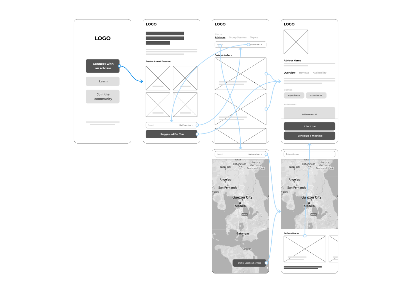
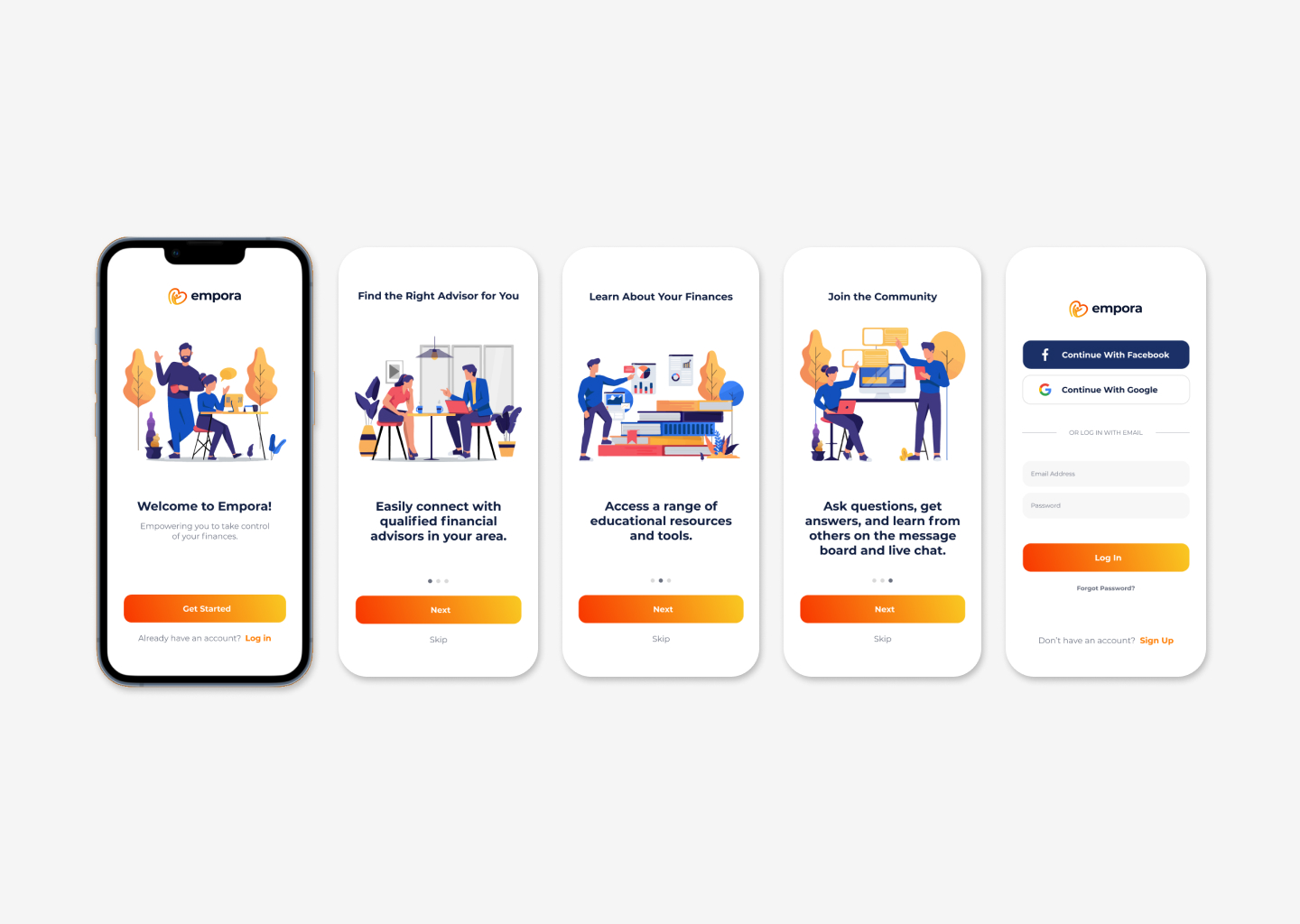
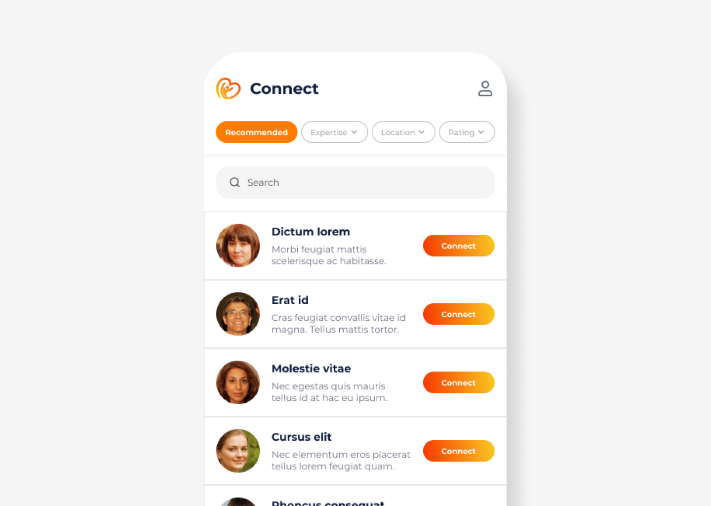
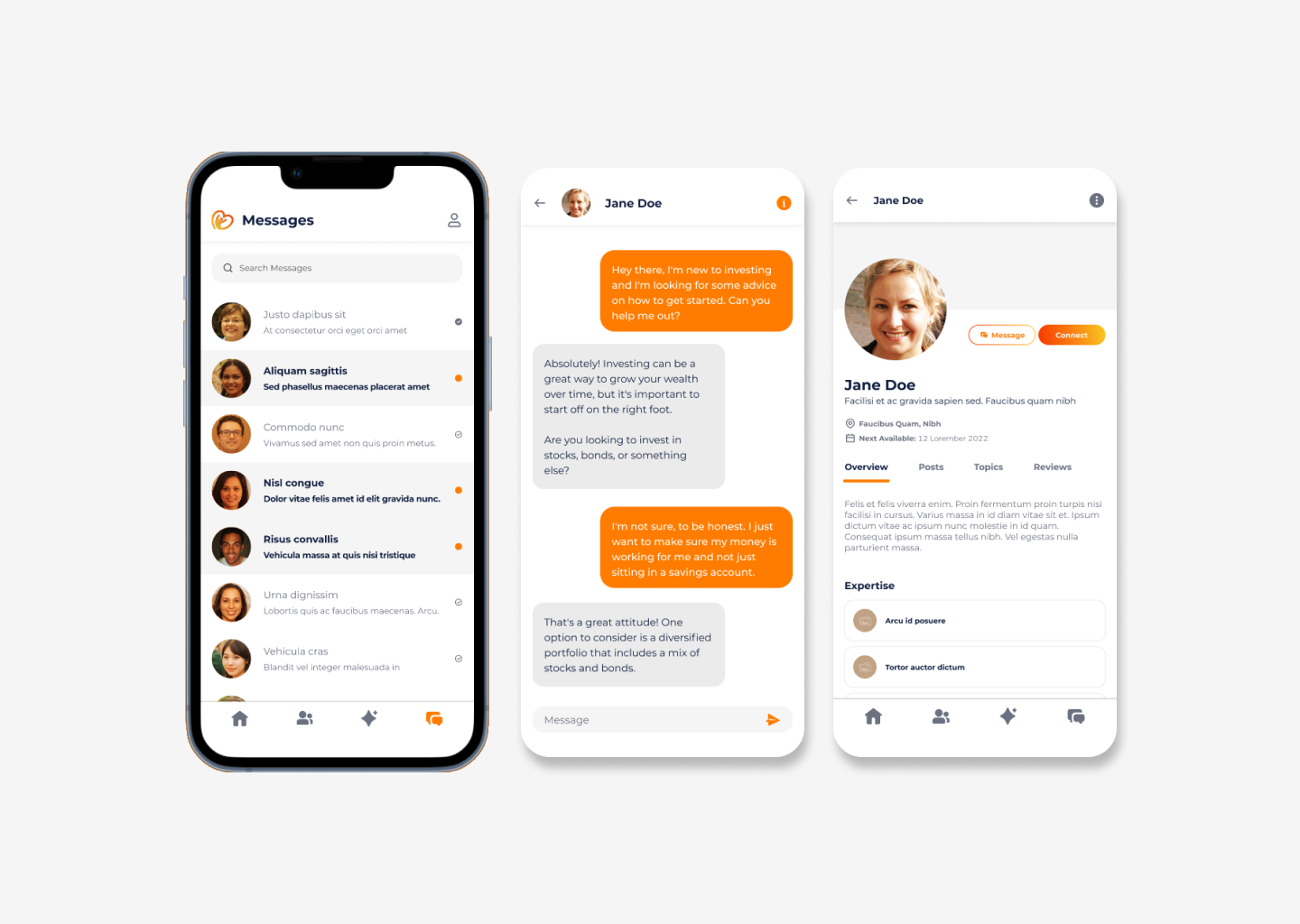
Empora is a mobile-first application that connects users with financial advisors and provides a range of resources to help them manage their finances effectively. The app features a search function that allows users to easily find qualified advisors in their area, along with access to educational articles, quizzes, and other resources. The app also has a message board and live chat feature, allowing users to connect with advisors and other users to discuss financial topics and get personalized advice.

The goal of this project was to design a simple and intuitive user interface for the app that would facilitate connections between clients and financial advisors, provide educational resources, and build a sense of community among users.

My role in this project was to design the user interface and user experience of the app, from the initial wireframes to the final prototype. I was responsible for creating the sitemap, the layout, the visual design, and the interactions of the app. I also had to work closely with the client to understand their requirements and expectations, and to incorporate their feedback throughout the design process.

First, I tried to understand the problem that the app was trying to solve, and the needs and pain points of the potential users. Since I was not able to conduct any user research or interviews due to the client’s limitations, I relied on my own background as a former financial advisor to empathize with the users.

The app’s target users are:

  • Clients: Individuals seeking financial advice from the advisors on the app. They may be first-time investors, high net worth individuals, experienced investors looking for new strategies, or anyone else seeking guidance on managing their finances.
  • Financial advisors: The primary user group for the app, as they are the ones providing the financial advice and guidance to clients. They are typically experienced professionals with a deep understanding of financial planning and investment strategies.

The user needs for both groups are:

  • Clients: To find and connect with financial advisors who can help them achieve their financial goals, to learn more about financial topics and strategies, and to interact with other users who share their interests and challenges.
  • Financial advisors: To reach out to potential clients who need their services, to showcase their expertise and credibility, and to build meaningful relationships with their clients.

Next, I defined the main goals and functions of the app, based on the client’s brief and my own understanding of the user’s needs. I created a list of features that the app should include, such as:

  • Connect function: This would allow users to easily find financial advisors in their area and connect with them for personalized advice.
  • Resources: This would provide users with access to educational articles, quizzes, and other tools to help them make informed decisions about their finances.
  • Message board: This would enable users to create and join discussion threads on various financial topics.
  • Live chat: This would connect users with financial advisors in real time.

Before I started designing the app’s user interface, I created a sitemap to outline the app’s structure and navigation. The sitemap shows how the different screens and sections of the app are organized and connected. It also shows the main user flows and actions that users can perform on the app.

Next, I sketched out low-fidelity wireframes to visualize the layout and content of each screen. I used wireframes to communicate my ideas to my client and get their feedback.

First wireframe draft showing the user’s journey when using the Connect function.

After a lot of design iterations and getting the approval from the client, I used Figma to create high-fidelity wireframes and mockups. I applied a consistent and appealing visual design across the app, using their branding.

The onboarding process is an important part of the Empora app, as it welcomes users and introduces them to the app’s features. The onboarding screens include a brief introduction to the app and its purpose, as well as a call to action to create an account or log in if the user has an existing account.

The home screen layout for the Empora app includes a navbar with icons for settings, notifications, and the user’s profile. The main part of the screen is divided into several sections, including a carousel of featured advisors and trending topics, and a newsfeed. The bottom of the screen includes tabs for the different sections of the app, allowing users to easily navigate and access the features they need.

I decided that having tabs for users to easily switch through functions would produce a better user experience.

The connect screen in the Empora app is designed to help users find and connect with financial advisors. The screen includes a search form, allowing users to easily search for advisors by keyword or other criteria. It includes a filter function, allowing users to filter the list of advisors by recommended, expertise, location, and ratings.

The resources tab in the Empora app is designed to provide users with access to educational articles, quizzes, and other tools to help them make informed decisions about their finances. The tab is organized as a single column of cards, with each card representing a different resource.

The messaging feature in the Empora app is designed to allow users to connect with financial advisors and other users in real time. The messaging interface is similar to other popular messaging apps, with a list of conversations on the left and the current conversation on the right.

Finally, I also used Figma to create an interactive prototype that demonstrates the app’s functionality and user interface. The prototype allows users to navigate through the app and perform different actions, such as connecting with advisors, navigate through articles, or chatting with other users. The prototype also shows how the app responds to user inputs and feedback.

The app’s design is simple and intuitive, allowing users to easily navigate and access the features they need. The app also fosters a sense of community among users, allowing them to share their experiences and insights with each other.