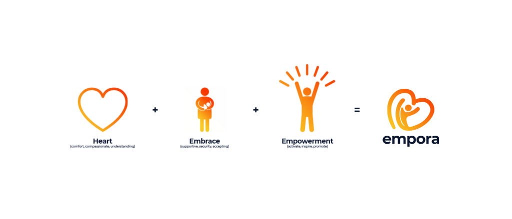
Empora

Rebranding

A company logo is like a first impression—you only have one chance to make a good one. In today’s competitive market, it’s more important than ever to have a professionally designed logo that accurately represents your brand and makes a strong impression on potential customers. Amateur designs simply can’t compete with the quality and polish of a professionally designed logo.

Not only will a professionally designed logo help your company stand out from the competition, but it will also give your brand a more polished and professional look overall. Investing in a professionally designed logo is an important step in building a strong, successful brand.

There are a few reasons why it’s important to choose a professional logo over an amateur one.

A professionally designed logo will incorporate the values, missions and visions of your company. A logo that is not made by a professional designer may end up representing something very different from what you want to convey about yourself/ business.

Professional logos are made with quality in mind. They include clear, concise text that can be read clearly by others. Unprofessionally designed logos may use lower-quality materials or send unclear messages to the public—or both!

Finally, a professional logo will be made with branding in mind. This means that the logo will be designed to help your company stand out from its competitors; an amateur design may not have those same objectives and could end up looking like many other logos in your industry.

Logo Use

Give the logo space. To preserve the integrity and visual impact of the logo, always maintain adequate clear space around it. It’s an integral part of the design, and ensures the logo can be seen quickly, uncluttered by other logos, symbols, artwork or text

When using the logo, take care to not harm its integrity by altering it or exercising your personal creative freedom.

For the most part, the logo will have the type and logo mark combined, but there are some instances when the logo mark can be used separate from the type such as icons, thumbnails and favicons.

Our Palette

Our colors are as important as the logo itself. They’re part of the brand’s personality.


#FACC22
Golden Buddha Belly


#F83600
Willpower Orange


#0D1833
Liberty Blue

Our Gradient

Psychology of Yellow
Yellow is perhaps the most energetic of the warm colors. It is associated with laughter, hope and sunshine. Accents of yellow help give the brand energy and will make the viewer feel optimistic and cheerful.

Psychology of Orange
Orange enhances a feeling of vitality and happiness. Like red, it draws attention and shows movement but is not as overpowering. It is aggressive but balanced — it portrays energy yet can be inviting and friendly.

Psychology of Blue
Blue evokes feelings of calmness and spirituality as well as security and trust. Dark blues are great for corporate designs because it helps give a professional feel.

MONTSERRAT

Montserrat is our official font and must be used when possible. It’s modern and sophisticated. It feels authentic and familiar. Montserrat is used in all our marketing collateral and the website.

This is also the font of our logo.

Light

ABCDEFGHIJKLMNOPQRSTUVWXYZ abcdefghijklmnopqrstuvwxyz
1234567890!@#$%^&*()<>?/

Regular

ABCDEFGHIJKLMNOPQRSTUVWXYZ abcdefghijklmnopqrstuvwxyz
1234567890!@#$%^&*()<>?/

Bold

ABCDEFGHIJKLMNOPQRSTUVWXYZ abcdefghijklmnopqrstuvwxyz
1234567890!@#$%^&*()<>?/

Alternate Font

Raleway

When Montserrat isn’t available or cannot be used, Raleway is an alternative that closely matches Montserrat. This is used primarily in PowerPoint and Keynote presentations and in Microsoft templates for things like the letterhead

Light

ABCDEFGHIJKLMNOPQRSTUVWXYZ
abcdefghijklmnopqrstuvwxyz
1234567890!@#$%^&*()<>?/

Regular

ABCDEFGHIJKLMNOPQRSTUVWXYZ
abcdefghijklmnopqrstuvwxyz
1234567890!@#$%^&*()<>?/

Bold

ABCDEFGHIJKLMNOPQRSTUVWXYZ
abcdefghijklmnopqrstuvwxyz
1234567890!@#$%^&*()<>?/

"Your brand is what people say about you when you're not in the room."


– Jeff Bezos, Amazon founder

It’s all about the brand.

Our brand is more than just a corporate color, logo or tagline.

It is the total experience of dealing with us. It’s what we stand for, what we offer and how we do business.

Our brand is a consistent promise that we make – not only to our clients, investors and business partners, but also to audiences that range from our competitors to our employees.

Our promise is that everywhere and every time we interact with them, we are the same Empora.

About

Financial Empowerment Advocates

People know that they should save, invest and plan for the future. However, most of them don’t. Then, when people retire, many say they regret not having acted earlier.
We discovered this was a universal phenomenon, and the reasons for not acting are as different as people themselves. This might seem like a problem for a financial services company. But we saw it as an opportunity.

In our research, people revealed that they don’t want relationships where they are told what to do. They want and expect to feel that they have determined their own paths.

Too many players in our business work to an old model in which customer actions are dictated. The door is open for us to shift the conversation to one about how we can empower people to make their own confident choices.

Putting these findings together, we saw a powerful opportunity: to use
our advocacy to help people break through their resistance – and to do so in a way that lets them feelgood about the choices they make

Who we are:

Trustworthy
Experienced and financially strong.

Insightful
Deeper than the obvious; using facts, not just claims.

Empathetic
We understand our customers’ world.

Answer driven
Ask the right questions and give smart, relevant answers.

Future oriented
Without talking only about the distant future.

Encouraging
Confident in their ability; the one they can trust to help them act.