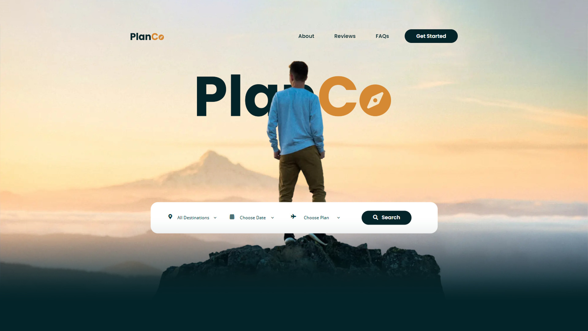
Flux Academy’s “From Brief to Website” workshop guides participants through the process of creating a website for a client. The goal is to help attendees understand each step involved, from understanding the initial brief to developing a plan and executing it to create the final product.
During the workshop, attendees are introduced to the client’s specific needs and goals for their website. They are also provided with an overview of common web technologies and considerations for planning a website that meets the client’s needs. Using Figma, participants create a website mock-up that incorporates the client’s desired design and functionality. They also have the option to use Webflow to develop the mock-up into a fully-functional website. Finally, participants help the client launch the website.
By the end of the workshop, attendees will have gained a detailed understanding of the process of creating a website from start to finish. They will also have contributed to the development of a complete website that the client is able to launch and promote online. The goal is to provide attendees with the skills and knowledge they need to successfully create a website for a client in the future.
PlanCo
Project Brief
Overview:
PlanCo is an outdoor travel planning agency based in San Francisco. Its mission is to help people get in touch with nature and explore new places off of the beaten path.
Product:
Customers fill in a questionnaire and get personalized, curated packages. The customer experience feels much more like a tech product (for example, Airbnb) vs. a traditional travel agency.
PlanCo pricing is higher than alternatives as it’s trying to position itself as an upscale option.
Market:
PlanCo is targeting the US market. Its main competitors are:
- www.wildernesstravel.com
- www.blacktomato.com
- www.mtsobek.com
Goal:
Persona:



Demographic:
- Man 25-45
- Working in tech
- Married with 1-3 young children
- Earning $150k/yr
Worldviews:
- It’s essential to get out of the city now and then.
- Hiking and camping get them in touch with their “inner man”.
- Wants to explore outside the familiar US. (“go where non of my friends has been”)
- Doesn’t like to talk to service providers on the phone, prefers to get things done online.
Day 1
Build a Brand Kit
It is important to establish the look and feel of a company through a brand kit before starting any design project. This ensures that all future projects maintain a consistent style that accurately represents the company. A brand kit includes the company’s logo, color scheme, typography, and other visual elements. Creating a brand kit allows designers to ensure that all designs accurately reflect the company’s desired image and brand identity.
SUBHEADING - POPPINS SEMIBOLD
Heading - Poppins Bold
Body - Open Sans Regular
Lorem ipsum dolor sit amet, consectetur adipiscing elit.
#032429
#023E48
#D68933
#C4D1D3
#FFFFFF
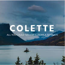
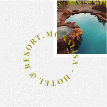

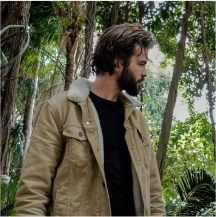


For a travel agency, the choice of fonts is important. I chose Poppins as the primary font for the agency’s website and marketing materials because it is simple, clean, and modern. It is easy to read and suitable for a variety of audiences. For body text, I used Open Sans, a slightly more subdued sans serif font that has a traditional appearance. It is easy to read and has a neutral look, making it versatile for different types of content.
In addition to the fonts, I also considered the emotions and feelings associated with the company’s services when selecting a color palette. The goal was to create a palette that evokes feelings of wanderlust and exploration. To achieve this, the chosen palette includes:
- Dark blue and green, representing the deep oceans and vast forests that travelers can explore on their journeys.
- Yellow, a warm and welcoming color that reminds us of sunny days spent discovering new places.
- Light blue and grey, representing the sky and clouds, which are always present on any journey.
The combination of Poppins, Open Sans, and the chosen color palette creates a cohesive design for PlanCo that effectively conveys a sense of adventure and excitement.
Day 2
Web Design in Figma
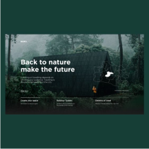
I used Figma to create a website mock-up for the travel agency. Figma is a vector-based design tool that allows for the creation of high-quality designs for digital products such as websites and apps. It provides a range of features for designers to use. The mock-up incorporated the client’s desired design and functionality, as well as the chosen fonts and color palette.
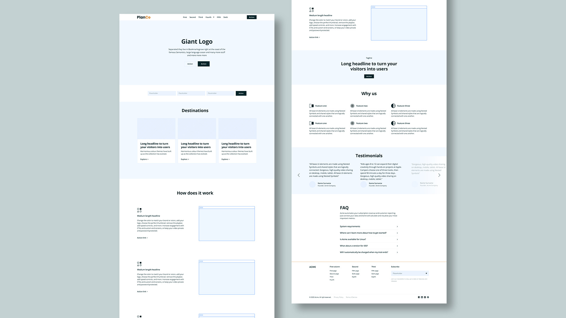
I created a wireframe before starting the more detailed design work for PlanCo’s website. Wireframing allows designers to create a skeletal structure for a website or app, mapping out the layout and functionality before starting the more detailed design work. This helps to ensure that the website is user-friendly and easy to navigate.
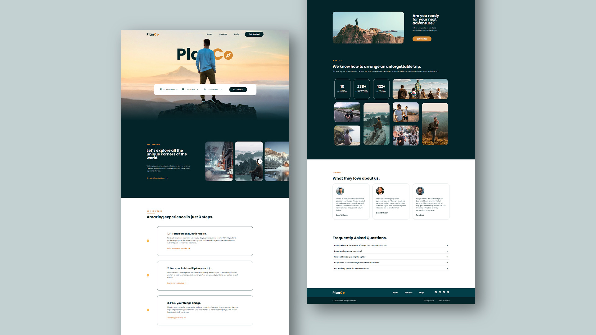
I designed the travel agency website with the following goals in mind:
- A clean and modern design that would appeal to the target audience of techy male professionals
- An easy-to-navigate website with all necessary information for users
- Relevant visuals and photos to enhance the website’s visual appeal
I carefully considered these goals during the design process and believe that the resulting website effectively meets them.
I believe that the design of the website reflects the needs and wants of the target audience and will be successful in attracting and converting users. I am confident in the design and feel that it effectively meets the goals of the project.
Day 3
Develop in Webflow
After wireframing the layout and creating the website mock-up with Figma, it was time to develop the design into a fully-functional website. The workshop suggested using Webflow, but I chose to use WordPress. I am more familiar with WordPress and believe it would be more user-friendly, allowing me to create a more efficient and effective website.
While Webflow may have some advantages, I felt that the learning curve is too steep and that it would ultimately take longer to create a functioning website using that platform. Therefore, I believe that using WordPress was the best option for this particular project.
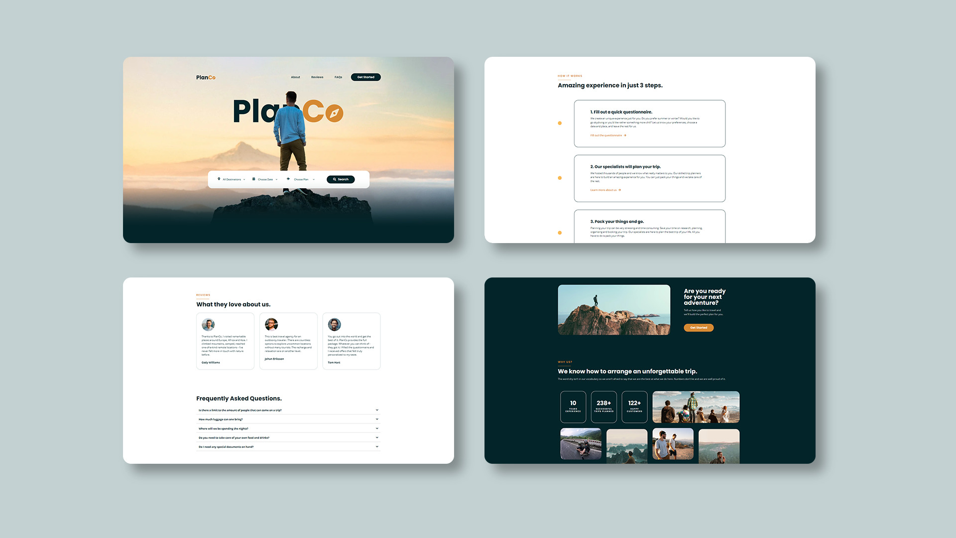
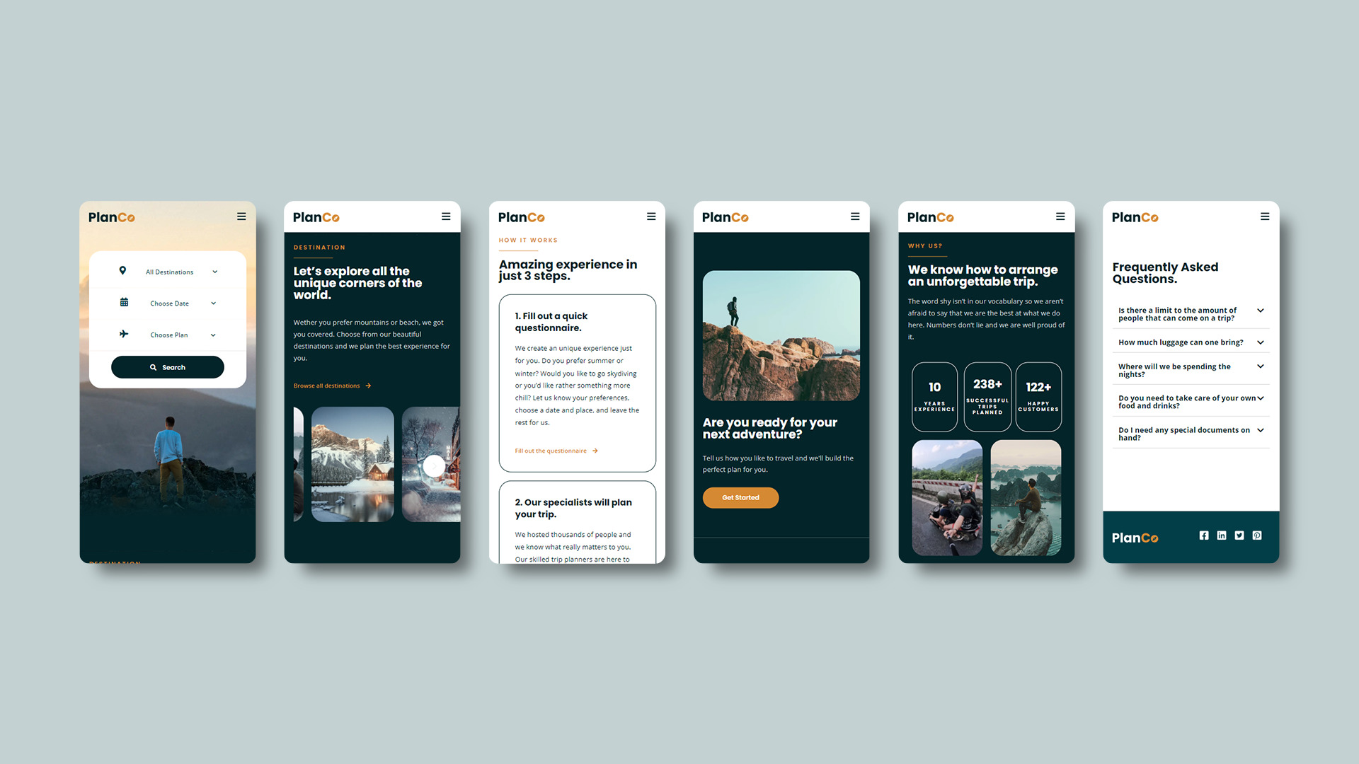
During the development of the website with WordPress, I ensured that it was responsive and optimized for all devices. I used responsive design elements such as resizing images and fonts and tested the website on various devices to ensure it looked and worked well on all screen sizes. These techniques allowed me to create a fully responsive website that is easy to use on any device.
Overall, I am confident that the website will provide a positive user experience for all users, regardless of the device they are using.
